Why Logos Should Be Simple And Timeless
As an Design Agency, Strife earns from qualifying orders.
By Strife Team • May 13, 2022
A simple logo design allows for easy recognition as well as versatility and rememberability. Timeless logos have a distinct personality without being overly drawn.
We live in an age of instant gratification and fast consumption, but when it comes to your business logo, evergreen is the way to go. While it’s easy to get caught up in design trends (everyone wants to be the cool new kid), prioritizing longevity over street cred will help you create a timeless design logo that will outlast the competition.
What Is A Logo?
To fully understand what a logo is, we must first understand what logos are used for. A logo is a symbol that combines text and images to help a user or customer recognize brands and distinguish between businesses. Logos have been a part of our culture for decades. Since the stone age, when the first man created a tool, he has craved recognition. To determine who made the tool and where it was made.
We see a lot of logos in our daily lives. Logos have become an essential part of daily life. We only pay attention to them when we want to. On our toothbrush, grooming kit, lipsticks, and soap, as well as our phone and car. There are logos everywhere. They are now a part of our lives.
So, what exactly is a logo?
A logo is a graphic mark, emblem, or symbol that is used to aid in public recognition and identification. It can be an abstract or figurative design, or it can be a wordmark that includes the text of the name it represents.
– Wikipedia
The best way I can explain:
Logos are symbols that combine text and images to help users and customers recognize brands and distinguish between businesses. A logo is a mark or symbol combined with a company’s name that is either a Trademark(TM) or a Right Reserved (®) of a company or organization.
However, A logo is so much more than that!
The journey of a business begins with a good logo and the goal of one day becoming a well-known brand.
It explains what you do, what services you offer, who you are, and what you value to users and customers. It’s not easy for a logo to act as the brand’s face!
One of the most difficult aspects of graphic design is creating logos. Only a professional can create a perfect logo that fits the brand’s needs while adhering to the visual and graphic rules.
The logo should be able to work on its own as well as with other branding and corporate materials. It, like employees, stationary, goodwill, and product, is one of the most important aspects of a company’s and corporate identity.
Because that is the purpose of a logo. To serve a purpose of resolving a problem or limitation that a business is experiencing in any way.
What Makes A Great Logo?
A good logo design is distinctive, appropriate, practical, graphic, and simple in design, and it effectively communicates the owner’s message. An effective logo usually has a concept or “meaning” that communicates the intended message. A logo should be able to be printed at any size and be effective without color in most cases. A great logo is made up of two elements: a great concept and a great execution.
A great logo is made up of two elements: a concept that resonates with its target audience and an execution that reflects their value system – both are critical for success!
Principles of a Great Logo Design
So, what makes a good logo truly great? The nature of great design is so subjective. Nonetheless, there are a few basic principles that go into creating a great logo.
1. Stand Out From the Crowd
Make your logo stand out and be different from others. It’s crucial to check your competition to ensure you don’t have the same logo or something too similar! This helps people remember your brand identity the more they see it! When this happens, you’ll be able to charge higher fees for your services without clients questioning why you’re so expensive. “I’m paying a premium for this product or service because I know that if I give them my hard-earned money, I’ll get something amazing from these experts,” you want them to think.
2. Keep it Super Simple
A great logo should also be super simple and straightforward. The more complicated something appears to be, the less memorable it becomes! Remember that simple logos are preferable to cluttered designs with too many fonts or images. This allows your audience to remember what they’re seeing after two seconds, rather than their eyes glazing over from all the information on screen at once (which is never a good thing!).
3. Memorable Logos
Some of the most well-known brands have logos that are both simple and memorable. Consider the Nike logo, which features the Nike Swish. Or the Apple logo, which is synonymous with…well, Apple. Your logo does not have to be overly complex to be effective. Many times, focusing on a simple concept results in a more timeless logo that will not look dated in two years.
Why Should Logos Be Simple?
When getting a logo designed, you may believe that you should get an elaborate logo with clever icons and graphics and multiple colors to get your money’s worth, but this is not the case. Almost all of the best logos are simple. Making a simple logo is also a real skill.
“But,” you say, “I want something that stands out.” The problem is that this will make your logo more difficult to remember and connect with.
Simple logos are more memorable, and you want customers to be able to recognize your logo quickly. A complicated logo is difficult to remember, especially when it’s on the side of a 60 mph van!
Second, when a complex design is used on small screens or even business cards, it loses details. Your logo should be able to be scaled up or down without losing detail.
Consider some of the most well-known companies and their logos.
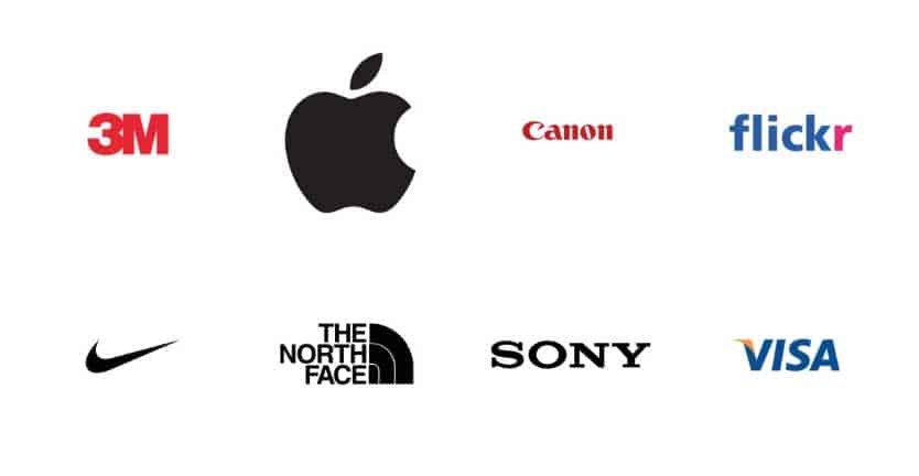
There isn’t a single bevel or elaborate icon to be found!
Many modern company logos were once more elaborate, but a logo for the digital age must be simple.
Many companies have had their logos simplified in recent years as part of a rebranding process. Take, for example, MasterCard.
That is why it is crucial to have a simple logo in this day and age that represents your brand so that you stand out of the crowd!
When you see a simple logo, you might think it was simple to create; however, it takes a lot of strategizing, brainstorming, trial and error, tweaking, and even starting over to get the perfect logo for your brand. An expert in simple design can assist you in creating a unique, eye-catching logo that will help you reach your target audience.
It should be obvious by now that keeping logo design simple is a good idea. Don’t be concerned that the final product will be too simple or uninteresting. You can make billions of dollars by being simple. Just ask Bill Gates, whose Microsoft logo is made up of four different colored squares. Or consider Steve Jobs, who chose an apple silhouette to symbolize his world-changing computer company. When it comes to sketching logo ideas, imagine yourself as a kindergartener rather than a rocket scientist.
Why Should Logos Be Timeless?
A good logo should last a long time. Is yours still going strong after all these years? A well-designed logo should last for at least ten years before needing to be updated. While a trendy element may look good today, it can quickly become outdated.
If you’ve spent years developing your brand, a logo change after only a few years isn’t ideal. One of the most important functions of a logo design is to build brand trust and loyalty over time. Your logo contributes to brand loyalty and ensures that customers have faith in your company. If your logo uses on-trend colors, imagery, or fonts, you may need to consider changing it sooner than you think to keep it fresh and current. This change jeopardizes your efforts to build brand loyalty.
Let’s examine what these timeless logos have in common:
- No special effects (no gradients!) and only a few colors (less than three).
- Simple typefaces
- Simple forms
- Easily identifiable
- Complex graphic elements are absent.
- There isn’t a single clipart image to be found.
- When scaled down, a logo can look great.
- There are no trendy elements.
- Last but not least – Super Simple and Straightforward.
“Leave fashion trends to the professionals.” Trends come and go, which is fine when it comes to buying a new pair of jeans or a new dress, but when it comes to your brand identity, longevity is crucial. Don’t go along with the crowd.”
It’s critical to get these details right if you want to create a successful logo and branding. Does your logo still look as it should in 2015? Need a Logo or Rebrand? Place your order today via www.strifestudio.com or Email Us!
Learn How to Design A Logo For Free!
Unleash your brand’s potential with our world-class playbook. Design a captivating logo design that leaves a lasting impression. Elevate your business today!